Wednesday 2 March 2011

Evaluation

In what ways does your media product use, develop or challenge forms and conventions of real media products?

During the research and planning of our title sequence I looked at codes and conventions both as a wider part of research but I also looked at the typical codes and conventions, which could be found in our typical genre for the title sequence. The sub-genre of our title sequence was crime/thriller.

"...Many of the feelings that typically attend being horrified are intrinsically unpleasant; for they include gagging, nausea, choking, stomach churning, tenseness, a creepy or crawling sensation, felt in the flesh, and so on." -Noel Carroll. I thought this was the best to describe some of the elements we needed in our sequence to show what the film was about. We were able to create the suspense and tension a key feature in many thriller and crime films. I think we captured this feature through our varied use of camera shots and the sharpness of each of the frames. One major effect we used throughout our title sequence was overlapping two different pieces of film; both pieces would be playing at the same time but the direction of the shots would be going in different ways creating a twisted feel to the sequence. This may have suggested to the audience that there was more to the narrative than what they were realsing within the first opening titles.

Being able to incorporate these codes and conventions into our piece of work made it much better and more professional than it would have original been if no research had been carried out into the genre we were aiming to recreate and represent in our title sequence. The title of a film does give some kind of insight into what the film is about without revealing too much. We wanted our title to still relate back to the genre and our narrative without being too obvious. It was important to look at different ways of interpreting the word ‘kidnap’ because our narrative itself was about a girl being kidnapped so we found words such as abduction, capture etc. By looking at different ways of adapting the same word we found ‘seized’ to be the best fitting title for our story; it still kept the element of surprise and anxiety that it would have not been able to do if we used one of the original words we had found as possible titles to use in our title sequence.

Who would be the audience for your media product? How does your media product represent particular social groups?

Our original idea of our film was to represent the over 15+ age range, we thought this would be the best audience area to aim for because we would not be restricted on different areas and we could expand on the different issues we were addressing in the narrative itself (if we focused on an age range below this we may have not been able to use some of the topics we based our film on). The characters in the narrative itself were based around the same age of the audience and therefore the viewer would be able to get more from the characters, as they would not have been able to do if they could not relate to the film. The title sequence covers the different social groups included in the age range we focused on- it has an element of surprise for those wanting adrenaline, features of deception and lies for those searching for a film with deeper meaning and overall an exciting project which purpose is to excite and entertain. 

What kind of media institution might distribute your media product and why?

I put a lot of effort into searching through different media institutions finding one which would be able to suit the genre itself, one which had previously dealt with films similar to the one we had developed ourselves and also one which had a good reputation and would publicise our film to our chosen type of audience. The final choice we agreed on was ‘Lionsgate’ they distributed films for movies such as American Psycho, Saw and Crash. By them having experience working with the thriller genre we thought this was the best option rather than going for an institution which were known for Romantic Comedies or Action films. 


How did you attract/address your audience?

A way that allows a film creator to attract their audience is by looking at their likes and dislikes. The key to any good film is by constructing something that has not been seen before. So to focus on this, we spent a lot of time working out which camera shots, soundtracks and transitions would come across best to our audience. The characters in the narrative itself were based around the same age of the audience and therefore the viewer would be able to get more from the characters, as they would not have been able to do if they could not relate to the film.

What have you learnt about technologies from the process of constructing this product?

From work we had done in preparation to making our title sequence, we had only used iMovie. Our teacher had suggested to us to take a look at using Final Cut Pro. At first the programme was very confusing there were many different elements that we had not seen before; we were ensured that by using this particular technology our title sequence would look much more professional. After a few hours of getting used to the programme we also agreed that it was the best choice for use to construct our title sequence in this way.


Looking back at your preliminary task, what do you feel you have learnt in the progression from it to the full product?

From looking back at our preliminary task I think we have found the importance of being organised. As this allowed us plenty of time to get the editing of our sequence up to the standard we had wanted it to be at.

I think its important to carry out research around whatever film project you are working on because it means having a greater knowledge and understanding of what your doing. This showed through our ability to address the typical codes and conventions of our genre.
Overall I would definitely say our title sequence has exceeded any previous expectations we had, and I am very pleased with the finished product.

Our Final Title Sequence


Friday 18 February 2011

Overall Summary of Feedback

It was important for us to get both positive and negative feedback so that we could better our title sequence.  

To get feedback we posted our title sequence on YouTube where people could comment on the video; overall the comments we got back all praised our film knowledge at the same time they offered some criticisms on areas we could improve. One criticism we received was that when the title 'Seized' appeared it was very fast paced; we took this into consideration and after watching our title sequence back a few times we agreed with this comment therefore we chose to lengthen the time which the title appeared which we believed benefited the title sequence. 

Another way which we gained feedback from our audience is by doing a few screenings to different types of people. Our media teacher offered to do a screening to one of her Media Studies classes where she gave out some of the feedback sheets we made up. A reoccurring answer throughout the feedback sheets was that the music was in some ways annoying to listen to. Taking this into consideration we realized that a possible reason for this was that the audience the title sequence was shown to, were of a much younger age than our original predicted viewing age; therefore they may not have appreciated the effects of the composition on both the pace and emotion of the title sequence. One more issue we found from analysing the feedback sheets was that the genre of the film was being mistaken for a 'Horror' rather than a 'Crime'. Although this mistake could be due to the fact that more is revealed to do with the genre throughout the film rather than within the first few minutes of the opening titles. 

Finally we showed our title sequence to one of our media teachers as we were happy with the final product. Unfortunately we had failed to complete research into the format in which the titles appear in a title sequence. After viewing some more title sequence we had realised the directors name always came at the end of the opening credits. Ourselves -being unexperienced title sequence creators- placed the directors name first in the credits. We decided to change this mistake we had made to make our title sequence more professional in the format which the titles appear. 

Friday 11 February 2011

Comments we have received on YouTube

So far all the feedback we have received on YouTube after having uploaded our title sequence has been positive and has credited our creative skills which we are very pleased with; we think much of this positive feedback has come as a result of our regular review of the title sequence and finding places where we could improve.


Some of the feedback sheets we got back

From these two feedback sheets we received we found that the genre of the film was being mistaken for a 'Horror' rather than a 'Crime'. Although this mistake could be due to the fact that more is revealed to do with the genre throughout the film rather than within the first few minutes of the opening titles. 


Wednesday 9 February 2011

Journal: 09/02/11

In today's lesson we created audience feedback sheets, we managed to get two filled out but we are going to receive more feedback when our title sequence is screened to Year 11 Media Studies students. Apart from preparing the audience feedback sheets we also continued to add to our blogs improving previous posts- this is because the construction section of our title sequence is now completed.

Audience Feedback Sheets

This is the audience feedback sheet Sophie made, we plan to hand these out to people who see our sequence; then we are going to have a look at the comments we get and possibly change some elements on the sequence itself if we think that there is any reoccurring issue that needs to be addressed. 

Screen shots of using Final Cut Pro

The first step of the editing process was to import all the scenes we had shot, to do this we attached the camera and imported all the clips; we made sure any important clips were named so they became easily accessible if we needed to use them. 


Our next step in the editing sequence was putting the clips we needed on a time line, to do this we simply dragged which ever clips we needed onto the timeline (from the previous screen shot where we named all the clips originally).


Now we began cutting the different things we had filmed into smaller chunks so they could all start being arranged in a way which enabled us to continue on and edit them further. 


Throughout the sequence we used fade in's and fade out's, this added a good effect to the title sequence because the filming flows and doesn't look as harsh as it would if the shots were to come straight in after each other.


This is the production logo I designed, as a group we thought this was our best option as it fitted in well with the sequence and was just bold enough for it to be noticed rather than take over the whole screen. The production logo is followed by a title which follows the same colour scheme. 


This is where we started making the text jump to give it a jumbled look. We thought this added depth to our title sequence because it was very deranged like our main character. 


Next we added music to the sequence, myself and Sarah spent a long time searching for a suitable soundtrack that went with the genre of the film- without it being predictable or giving too much away within the first few minutes of the film. As a group we decided on the final choice of music and we thought it worked very well with the narrative; the music itself flowed well with the different climax's in the sequence . 


This is our final title sequence, as a group we are extremely impressed at the final product it reached all of our previous expectations. The music, the setting, the filming and the editing itself all came together at the last stage and made the title sequence look really good. 

Final Typography Choice


This is our final typography choice, we chose this because we thought it resembled our genre and narrative in a way which did not reveal a great deal of information to the audience.  We decided the white typography would be best against the black background because it made the title stand out. The reason for choosing this font was the fact that the lettering itself is not sharp or neat and is slightly decaying, this resembles our main characters state of mind- he is constantly having to deal with issues which are mentally destroying him; therefore the breaking of the white onto the black shows that our main character is slowly falling apart. 

Monday 7 February 2011

Casting for our title sequence

During the filming of our title sequence we used two people: 
Emily Neil: Emily played our main character as the girl who was being followed by our stalker; she also contributed the scream which is heard towards the end of the sequence-which added great dramatic effects to the entire sequence.

Jon Purday:Jon acted as the part of the stalker/follower, it didn't take long for him to get into character and throughout the filming he gave lots of variety in his acting which allowed us to have more shots to choose from during the final editing of the sequence. 

Final Chosen Soundtrack

This is our final choice of music which we have used in our title sequence, we thought it would be a good idea to fins a certain soundtrack which represented our genre but was not an obvious choice of sound. 


The music begins with soft under tones of wind; these created a mysterious feeling which added suspense to the narrative of the title the sequence. After the intro of the wind noise a sharp set of harmonics kicks in- this is shocking to the audience as it is not expected, the dark droning background in the music creates a sense of menace which accompanied the sequence greatly. This is because although we had varying shots the music fluently followed the increase in pace but still allowed a faint dark under tone throughout allowing the genre of the film not to become lost in the soundtrack. 


Our soundtrack first appears when the production logo appears on the screen which is when the sharp harmonics begin, followed by the rest of the music. The soundtrack finally comes to an end before the final shot in the title sequence- when the music stops the screaming sound and breathing sounds are heard. 

Click to listen: In the beginning

Journal: 07/02/11

In today's lesson I continued editing my blog and adding more to the different posts, making a more detailed analysis of title sequence's. Also we took pictures of the cast members involved in the title sequence and added them on a post about casting on the blog. 


In the next lesson we will be preparing audience feedback sheets which we will take comments from on the positives and negatives of our title sequence. 

Friday 4 February 2011

Journal: 04/01/11

EDITING COMPLETE

We managed to complete all the editing today way ahead of schedule which gives us a lot of time to write a very detailed evaluation. As a whole we are very pleased with the final copy of our title sequence; from previous audience feedback we received we made sure all the negative comments were addressed and in turn the sequence adjusted to suit those comments.

Music Research

A major part of our title sequence is finding the right piece of music which sets the tone without becoming too over powering, we found searching for a soundtrack which meets all of our expectations extremely hard. We began we looking for non-copyrighted music on the audio.lgfl website which had every kind of music anyone could want. Here are some of the tracks we found...


Click the track to listen to the song:
Track One-Cold City
This was our original choice of music to go with the title sequence, we thought this was not too typical or predictable to go with our genre of the film because it had a slight edge to it.One issue we had with this particular composition was that the pace changed throughout the song therefore it was difficult to make it fit with the pace of each different frame. We thought the effect the music was having on the title sequenced messed with the climax and anti-climax. 

Track Two-In Memoriam
We thought this track would be better suited to a T.V series rather than a film; the composition itself did fit the crime genre although we found it to be far too predictable for our liking. 

Track Three-Hell's Harp
Our third option of a suitable soundtrack to go on our title sequence; the song itself was very eerie and added great suspense and action to the sequence but we felt it was too extreme for our sequence it would be better suited to a title sequence for a 'horror film' rather then a film of the crime genre. 

Wednesday 2 February 2011

Journal: 02/02/11

In todays lesson we managed to find music to add to our title sequence after looking for about 2 weeks.
We settled for a mix of wind noises and sharp harmonics; we thought this fit not only the title sequence perfectly but also the genre we had chosen in the beginning-crime.

Towards the end of the lesson we saved our almost complete edited edition of our title sequence, in a suitable format to show the whole class and our teacher to gain some feedback on areas we could improve at.

From the feedback we received, we found we needed to:


  • Fade out the titles, so they didn't just disappear 
  • Alter the spelling of one of the titles
  • Decide whether we wanted to keep our opening scene
..........we will be sure to adapt our title sequence to suit the feedback we received in our next lesson on Friday. 

Tuesday 1 February 2011

Journal: 31/01/11

The search for music continues......

Luckily in this lesson the majority of the editing is now completed so we are defiantly on schedule to have completed our title sequence by the 18th or maybe even before- if we find our music within the next week.

Friday 28 January 2011

Journal: 28/01/11

In todays lesson we basically carried on editing our title sequence. We are nearly finished however, finding music to fit in with our piece of music is very difficult so we are still on the hunt for this! A thing that we did start to do today was to add our titles to our title sequence. We searched Final Cut Pro for ages to find an effect for our titles that we like but we couldnt find one. The kind of effect we wanted to use was to make them look like they are jumping and moving about in a awkward way. To do this we asked Jerry, a technician to help us. He told us to cut the titles into small chunks and move them about. This worked really well but takes a very long time to do! We hope to get this finished next lesson.

Our Final Production Logo


"With each of the previous production logo's we used a white background with black imagery and typography; in this design we used a negative effect to vary our possible options. The typography resembles the different strokes of the feather. In this design we were able to incorporate all the different elements we realised from our first few designs. The contrast of the white on the black creates a softness to the image without losing the sharpness on points of the feather. So far this is the design which we are most likely to use in our opening title sequence as it fits in with the whole look of the sequence."

We chose this for our final production logo as we could easily incorporate this into our title sequence without difficult as the black background was simple to add in on 'Final Cut pro'. 

Wednesday 26 January 2011

Journal: 26/01/11

In todays lesson we continued editing by adding both our production logo, title, and the Lionsgate opening sequence. Myself and Sarah both began searching for music/sound to include in our title sequence; the difficulty we faced was making sure the music was not so dramatic to make our title sequence seem a cliché of the typical crime/thriller genre. The search for music continues....

Monday 24 January 2011

Journal: 24/01/11

In today's lesson I continued analysing the production logo's we had created, we also continued to edit the filming we have done so far. Throughout the editing process we have realised that it is best some parts of our original idea are cut to eventually produce a better overall title sequence. 


From our original storyboard we had planned to have a scene where you could see the stalker chasing the girl in the background of a focused shot on the iPod. Firstly, we were not pleased with the original filming of the frame- this would have meant re-shooting and therefore loosing time for the editing process. We decided that we would rework the scene's to make them flow not loosing the original narrative of the title sequence. The final product itself we believe added more tension and excitement to the sequence than it would have done if we had proceeded with the original idea.


During our title sequence we have a chase scene, unfortunately when we watched it back the standard of the filming was not very high- the camera made continuos shaking movements which may have made the audience feel some motion sickness. We addressed this problem by incorporating shots of the book in between the chase sequence this meant less camera movement making it seem more professional. Even though our original concept was to have a point of view shot we felt it was best to split the frames to make them come across better to the audience. 

Friday 21 January 2011

Production Logo

This is the very first production logo we created, the feather itself has slightly been softened, and the typography we used follows a movement which mirrors the feathers movement. The typography colour has been faded in a way which adds a softness to it again relating make to the feather image. This is not my favourite production logo because it is very basic and there is no dimension to it or fading of colours or graining of the image. 


This was the second production logo we designed; from the first design we realised the different elements we had to consider to create a production logo which was the opposite to the first one we designed. Firstly we began by strengthening the dimensions of the feather making it more darker adding further depth to it- which we did not achieve in the original design. Also we added graining over the entire logo this give's an essence of the silent movie era. I thought it would be a good idea to use a typography which resembled an earlier period therefore I chose a font which looked like it had been hand written with ink; the typography also has a motion to it which follows the feathers shapes. A criticism of this design was that the heavy graining could have a harsh effect on the eyes. 


By coming to the conclusion that the heavy graining on the image is harsh on the eyes we used a different effect where there is a focal soft point in the middle of the images and the brightness gets darker towards the corners of the production logo.Firstly we began by strengthening the dimensions of the feather making it more darker adding further depth to it- which we did not achieve in the original design- as we did in the previous design.


With each of the previous production logo's we used a white background with black imagery and typography; in this design we used a negative effect to vary our possible options. The typography resembles the different strokes of the feather. In this design we were able to incorporate all the different elements we realised from our first few designs. The contrast of the white on the black creates a softness to the image without losing the sharpness on points of the feather. So far this is the design which we are most likely to use in our opening title sequence as it fits in with the whole look of the sequence.    


This was our next attempt at a production logo, we had the idea to relate the logo to the genre of our film, so we used a dark ash grey to create a dark mysterious mood to begin the title sequence. As in previous designs we chose to use a typography which mirrors the movement of the feather, as for the colour of the font we chose a slightly lighter version of the grey we had used for the feather- first we used the same colour but found that the writing could sometimes be lost in the background; but by using the lighter colour we were able to make the production name stand out against the black background. 


This was our final design for a possible production logo; in previous designs we had used a dark background with lighter imagery. So, in this design we went back to our original design with the lighter background and then chose a varying grey for the feather and writing. We used a soft effect on the image  of the feather as we thought it created a pleasant effect as it had done on the first and third designs. As for the typography, we juxtaposed the previous idea of having the font mirror the movement of the feather and chose a sharper type of typography; although bearing this in mind throughout the different letters there are breakages which could show some of the strokes in the feather. 


Journal: 21/01/11

In todays lesson we were attempting the editing process of our title sequence. We began experimenting with different transitions and effects to try and get an idea about how to use 'Final Cut Pro'. Also we done some more work on our blogs- I focused on developing my analysis of title sequences further, to gain a greater understanding of how to structure different parts of a title sequence in order for it to flow. 

Wednesday 19 January 2011

Journal: 19/01/11

LIGHTS.....CAMERA......ACTION 


In todays lesson our main objective was to finish all our film, we manage to get all the final camera work completed and managed to upload it ready for editing. The filming process itself went very smoothly although we did have to do a few retakes to ensure the camera was in the right position. The chase sequence itself needed focus from every member in our group, we were able to shoot it a few times without loosing light. A couple of run throughs made sure we were aware of what we were doing. 


Getting ready for filming

Monday 17 January 2011

Journal: 17/01/11

In todays lesson we filmed more shots of the book- we plan to use these shots at different points in our title sequence. As a group we thought filming the book at different angles would add more variation to our title sequence. The different shots were filmed at specific angles so we had a clear space to put in titles during the editing process.

Friday 14 January 2011

Journal: 14/01/11

FILMING BEGINS


Today we started the filming production, our first scene we began shooting was the book sequence; we needed a male character to feature in this part of the title sequence, luckily our media teacher was able to help us although his identity in the camera shot itself remains a mystery because our lighting made him appear as a silhouette.

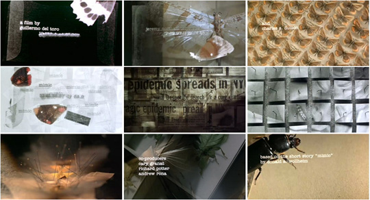
Title Sequence Analysis: 'Mimic' (1997)


"In Manhattan, cockroaches are spreading a deadly disease that is claiming hundreds of the city's children.Entomologist Susan Tyler (Mira Sorvino) uses genetic engineering to create what she and her colleague (and husband) Peter Mann (Jeremy Northam) call the Judas Breed, a large insect (looking like a cross between a termite and a praying mantis) that releases an enzyme that kills off the disease-carrying roaches by speeding up their metabolism. The Judas Breed work spectacularly and the crisis is abated. Since the Judas Breed have also been designed to only produce one male able to breed, and they keep it in their care, the hybrid species should die out in a matter of months.
Some years later, people begin to go missing in the subways and tunnels under the city. Susan, Peter, and their staff learn that they severely underestimated the Judas Breed's ability to adapt to its conditions. The Judas Breed has found a way to reproduce and has evolved in order to better hunt a new food source. To everyone's horror, they discover that the Judas' new food source is humans, and now the insects have grown to be as big as people and can mimic the appearance and behavior of humans with uncanny accuracy. Susan and Peter have learned that huge swarms of the Judas Breed are living beneath the city in the subway system, and with the help of Leonard (Charles S. Dutton), a transit system police officer, they search out the insects, whose quick evolution (one fertile male and hordes of females) also made them humanoid, before they can take over the city and from there the world." -wikipedia


Mise-en-scene

            Similar to opening title sequences like ‘Se7en’, this sequence has a dark over tone over the filming. The filming looks as if it has a desaturated effect over it; this use of colour effect adds edge to the emotions being felt by the audience.
The lighting in ‘Mimic’ changes constantly, there is a dramatic sharp change from dark to light-this same pattern of dynamic alterations in light creates a disturbing, confusing effect on the mind of the audience. The title sequence’s use of lighting helps to suggest the type of genre of the film. This highlights the fast pace narrative of the film.  The opening sequence features no actors therefore there’s no introduction to the characters leaving the audience questioning who the main characters of the film are. Normally the genre of thriller and horror include the element of suspense and the unknown, this could be a reason why there are no characters featured in the opening sequence. Opening sequence’s normally include a backing sound track or a voice over although ‘Mimic’ has a dynamic composition of a variety of sounds; sometimes this is just a short tune created by sharp sounds then at very random points a voice over is heard although this voice over sounds like a radio transmission. The title sequence includes various camera shots they change rapidly to increase the pace and the amount of features found within any one frame.


Purpose and Character

            One major element missing in the title sequence of ‘Mimic’ is there is no characters, where the camera shots are moving so fast there is hardly a second to take everything-creating almost a claustrophobic environment for the audience. Many of the images in the sequence are jumbled perhaps suggesting there are a lot of mixed characters in the film itself. This jumbled effect also creates a disturbed state of mind for the viewers to consider enabling them to make links through the variety of images shown in the title sequence.  Throughout the sequence as the titles appear so do images of destroyed butterflies; this could suggest destruction of nature and therefore leading to destruction of the mind. The direct contrast of the destroyed butterflies and then the perfectly displayed butterflies shows there is a fine line between both beauty and destruction. This juxtaposition could represent the mix of good hearted and cold twisted characters who develop in the narrative. Also featured in the opening titles are images which look as if they are school profile shots, the same photo is not repeated showing that the focus is not on one person but many; this could highlight the need to keep a constant trail of thought throughout the film to try and work out for yourself what is going on as different events are occurring. In other words, linking past events to the present.

Cinematography

            This opening title sequence includes many close ups and extreme close up’s which make the surrounding extremely focused on a particular point. The majority of the lighting in this title sequence is dull; this dullness is used to create a frightening and unpleasant atmosphere. The use of dull elements does not stop at the lighting it continues into the colours, which are included. The main bulk of colours are rather dark such as shades of brown, black, and charcoal grey. These colours contribute a dark menacing tone to the entire title sequence.  Soft edged rays of light appear over some of the elements featured in the frame; this could emphasise the different events, which happen during the film are very dark and mysterious. Fast pace has been used to include many things creating excitement towards the movie, leaving the audience with a desire to want more. The negative effect, the change in colour on some of the images is very unexpected and shocking revealing what they truly are.  In relation to the film this could mean that some of the characters become seen to be who they really are; this leaves the audience questioning the different characters identities. All the things included in the title sequence portray the things which the director enjoys featuring in his work, "I have a sort of a fetish for insects, clockwork, monsters, dark places, and unborn things." 


Wednesday 12 January 2011

THE BOOK!

The book full of CCTV images

Pages showing CCTV images

Pages showing CCTV images

Pages showing CCTV images

Pages showing CCTV images 

Pages showing CCTV images

Journal: 12/01/11

In todays lesson we printed off our CCTV images and added them to the scrap book which is going to feature in our title sequence. 

Monday 10 January 2011

Typography Ideas


We chose this typography because we liked the non-imediate juxtaposition between the black background and the white text.The text is enlarged but slightly faded this gives the a focusing effect on the title. I like this type face because it has a slight distressed look to it which could relate to the distressed mind of our main character in the film. One criticism of this type face is the boldness of the lettering, although it does draw attention to the title it is a very obvious choice of typography for an opening title sequence; therefore it may be best to find the right composition between the boldness and lettering for our title in the opening sequence. 


This second typography example was chosen because it looks as if it has been hand drawn with a marker; we thought this would relate to our film because our main character creates his own book and shows he has a created yet twisted mind. The etching in the text shows the twisted state if mind the character in our narrative. Although this concept could also make our film very predictable and we don't want to give too much away about the entire narrative within the first few minutes; as our film is built on suspense and drama. So we need the element of surprise at the same time as we need the element of a twisted mind.


This is the third typography design we came up with, we found that the way in which the letter 'e' was mirrored created the effect of something being twisted and not right which resembles our male lead in the narrative  as his mental state is twisted and in a way not right. 


Type of Audience

There are some questions which need to be asked before deciding the audience of our piece these include:
  • What kind of people may be interested in your story?
  • Young people, older people?
  • People from different communities?
  • Specific groups of people?
  • What else might your target audience go and see?
  • What would they watch at the cinema?
  • What would they watch on television?
  • Would you want to watch your film?
  • How would you rate the content of your film?
Q:What kind of people may be interested in your story?
A:I think the type of people who may be interested in our story would be those who enjoy the excitment of the unknown and the constant questioning of what may happen next.

Q:Young people, older people?
A:The age range which we decided to aim our film at was the over 15s, therefore we would expect above 15 year olds onwards. So our film is aimed at both young people and older people.

Q:Specific groups of people?
A:There is not a single specific group which our film is aimed at although we would not recommend it to those who do not enjoy the genre of crime, thriller or drama.

Q:What else might your target audience go and see?
A:Our target audience would most probably go see films within the genre's of horror, crime, realism, drama possibly period drama's and also thriller's. Films such as 'The Stepfather', 'Disturbia' etc.

Q:What would they watch on television?
A:There could be a range of programmes which our audience may go see from documentries on the topic of crime to social realism as our film relates to some issues which arise in society.

Q:Would you want to watch your film?
A:I would watch my film because it falls into the genre of film I enjoy watching, also there are constant climax's and cliff hangers throughout the film enabling the audience to want to know what is going to happen next. Also I would enjoy watching the film because it is the type of film which always keeps its audience on edge.

Photo's of the different settings we are planning to use

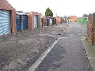
These images were taken to show the various locations we may possibly be using for our title sequence. The following images show a range of possible locations if others are not available at the time we need to film.

The images below are of the different locations where we can set up our desk scene:


The next set of images we took show possible locations for the stalking scene which runs alongside the desk scene featuring the book of CCTV imagery:


Finally these images show the scene where the audience experiences the struggle between the man and girl, when the camera is on a tilt; it is also where the stalking sequence comes to a climax:


Some more CCTV imagery